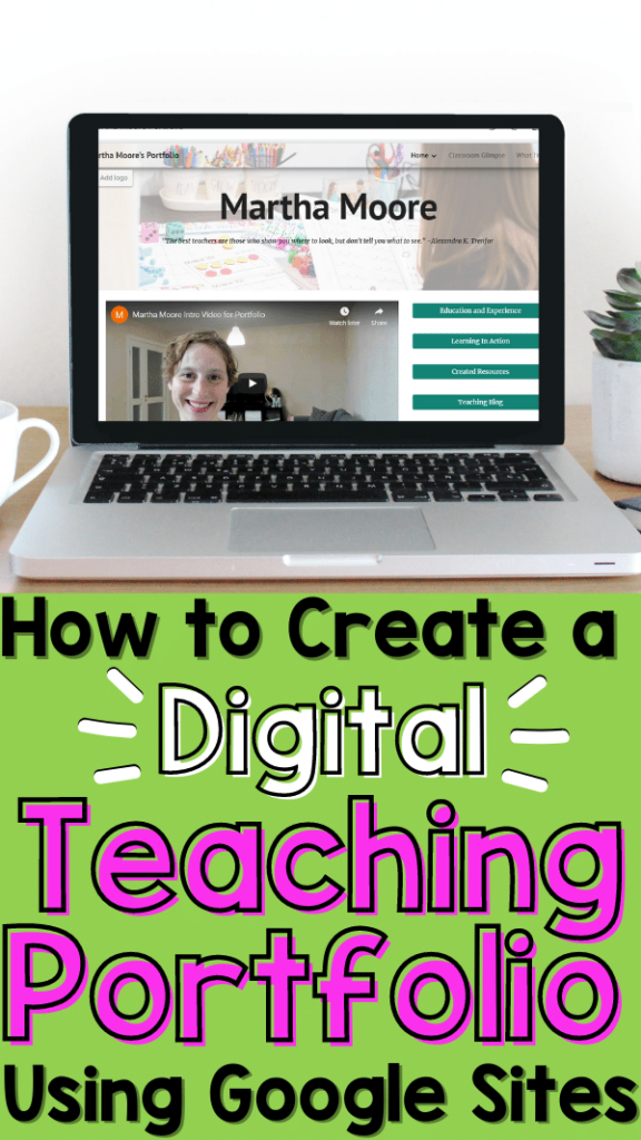
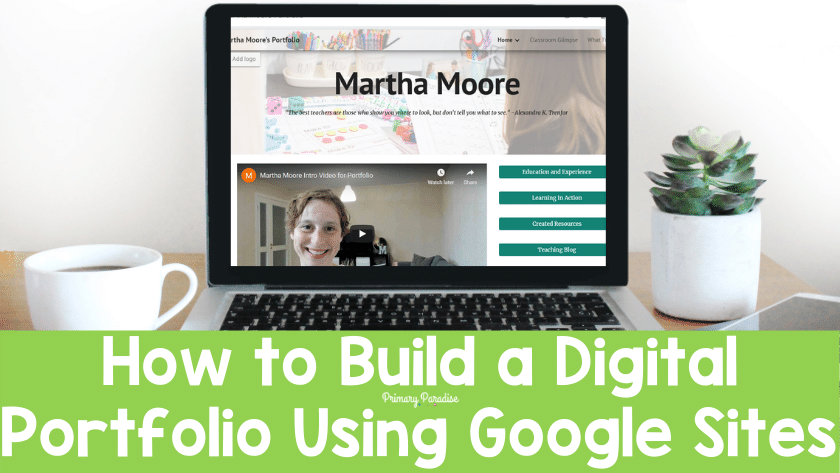
A digital teaching portfolio can be a super versatile and handy tool when you’re looking for a teaching job. It’s a great way to showcase your work, is easy to update and keep organized, and can be accessed through any device. Google Sites is a great option for creating a beautiful, organized, and effective portfolio for free. Let’s dive into why you should use Google Site to create your teacher portfolio, how to do it, and what you should include in your teaching portfolio.
Why Google Sites for your Digital Portfolio?
When it was time for me to create my most recent portfolio, I decided to go digital. Gone are the days of lugging a massive binger to interviews. I began to do research to see what platform would be the best bet. After trying about 5-6 different platforms, I landed on Google Sites. Although I do suggest giving a few platforms a try, I can tell you there are 5 reasons I went with Google Sites.
Top 5 Reasons to Use Google Sites to Make a Digital Portfolio
- It’s free. Let’s face it. I didn’t want to pay a subscription for a portfolio that I will likely only really need every few years. Google sites is totally free.
- It’s user friendly. If you’re already comfortable with Google products and platforms, Google Sites will feel very comfortable to you.
- It gets the job done. There are some really amazing platforms out there for creating digital portfolios. They offer all kinds of great bells and whistles. However, Google Sites does enough. It allows you to share videos, links, and format pages how you want. It might not have every feature out there, but again, it’s free.
- Privacy options. Although I didn’t include anything on my Google Sites Portfolio that I wouldn’t share with the world, I liked that I could set my site to public OR only people with the link. This is super helpful if you don’t want any random person to stumble onto your site.
- I could pick my URL. Although Google Sites doesn’t allow you to totally customize your URL (I can’t make it MarthaMooreisthebestteachereversohireher.com), I can add my name or whatever I want to my URL. So, your URL will be sites.google.com/view/insertwhateverhere. I liked that I had some control over my URL. With other paid sites, you can have a totally custom URL. However, I opted to use bit.ly to create a shorter, easier to use URL as well. Options!
How to Create Your Digital Teaching Portfolio
Pick a Google Sites Template
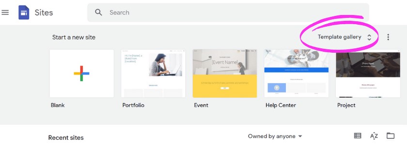
Of course it will really come down to how you want to set up your portfolio, but I’m going to share the basics of Google Sites and the options you have. First, head to the Google Sites homepage. You’ll see a few templates, and if you click on “template gallery” you’ll see some more. Now, as of right now, there aren’t tons of template options. However, there’s enough to get the job done. Since you can edit and customize them, I recommend picking one you like the best and then getting to work. I personally went with “portfolio”.
Edit the Header and Homepage Elements
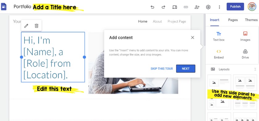
After you click on a template, if it’s your first time, it will offer you a tour. It’s pretty helpful, and I recommend reading through it. You can edit and change all of the elements on the page, so I recommend hovering over things and click on them to see the options. I personally decided to create a larger header banner and add my own image. To do this, hover over the header section (where it says your name and then home, about, project page).
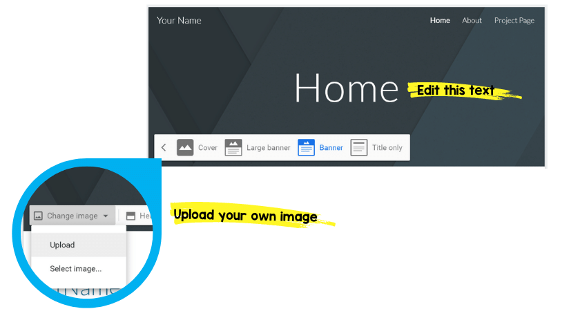
After you’ve designed your header, you can add any other elements to your front page. I recommend using this page as a “snapshot” or landing page. Share a summary or a glimpse into your teaching style and experience, and use it to link to other helpful pages.
Add Elements and Customize Your Design
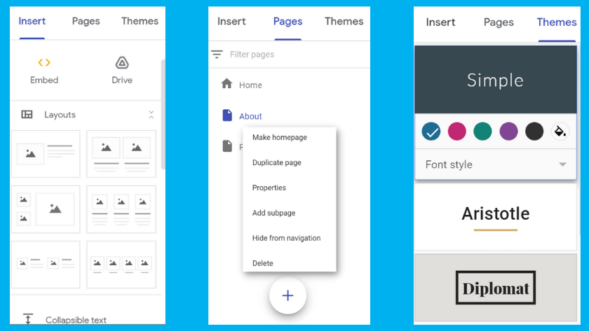
On the toolbar on the right, you can add text, images, embed videos, pick different layouts, and add kinds of different elements. Play around and don’t be afraid to try different things. You can undo anything you don’t like, and changes are saved automatically.
You can add different pages on the toolbar as well. To edit an existing page’s name, just click on it. To add a new page, click the plus sign at the bottom.
Lastly, you can change the theme, the font colors, and the font. Again, there aren’t a ton of options, but enough to get the job done.
Settings, Privacy, and Sharing Options
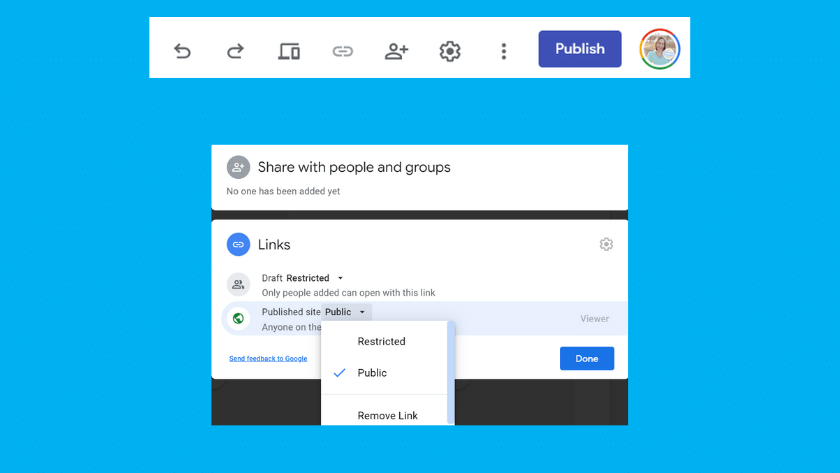
Before we dive into what to include in your portfolio, let’s talk about the top bar. It works just like most Google tools. There’s undo and redo buttons, the option to preview your site, a spot to grab your link (only available once a site is published), a spot to set your share settings, and a setting gear where you can change settings for the whole site like changing your navigation options, looking at site analytics, and so on.
When you pick your share settings, you can choose having a public site, or a restricted site. If you set it to public, anyone can see it. Be sure to keep this in mind when it comes to student images, work, and data. If you select a restricted site, this will mean only people you give access to can access your site.
Lastly, you can publish and unpublish your site at any time. So, if you publish your site and then realize you want to take it down, either to make changes or permanently, it’s very easy to do.
What Should I Include In My Digital Teaching Portfolio?
The easiest way to explore how to build a Google Site teaching portfolio is to jump into what to include in your portfolio. Of course, this can be a very personal decision, but I’m going to share what I included in mine and why. Just keep in mind that the goal is for someone to spend 5-10 minutes looking at your portfolio and have a good idea of what kind of teacher you are.
Introduction and Learning Philosophy
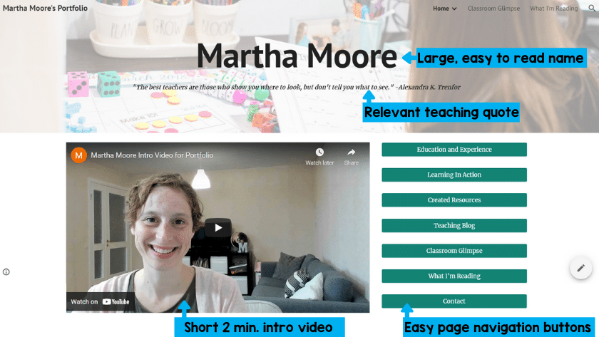
First, I recommend sharing a short introduction on your homepage. As cliché as it is, I think it’s also important to share your learning philosophy. I chose to create a short video for my introduction (which you can view on Youtube here), but you could type a paragraph instead. Try to pick 4-5 things that are really important to you and about you as an educator and highlight those. This might be the only thing that people view, so make it count. And, remember, people have short attention spans, so keep it short and sweet.
Education and Teaching Experience
Again, this isn’t anything revolutionary, but it is important to include your education and teaching experience. Also include any awards, certificates, and special skills that are teaching related. Essentially, you want to include your resume. I recommend including this as one page on your digital portfolio. Be sure to continue to update this often.
Recommendations
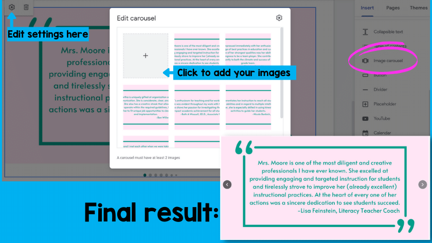
This is of course optional, but it’s a good idea to include recommendations from other educators you’ve worked with. I opted to create a moving carousel of short quotes from past administrators and teacher’s I’ve worked. Some quotes I pulled from letters of recommendation I already had. I also asked a few people to share a few sentences about what it was like to work with me. Although long letters of recommendation are great, something short and to the point can be just as, if not more, effective.
To create mine, I inserted an image carousel. I used Canva to create images of the quotes and then added them into the carousel. It rotates through them slowly. I included this right on the homepage, but you could include it with your experience, or somewhere else if you wanted.
A Peek Into Your Teaching Style & Classroom
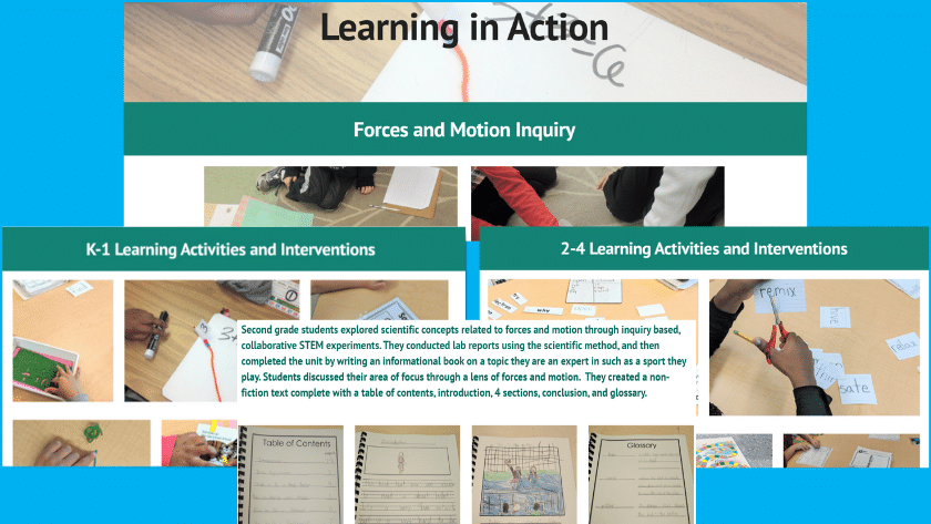
If you’re looking for a teaching job, the administrators, principals, and even other teachers who are looking at your digital teaching portfolio are going to want to know what your classroom is like. What is your teaching style? What kinds of activities do you utilize? If possible, share a glimpse into your classroom and teaching style. You could write a few examples, create a video, or share pictures. Just be sure that you aren’t including students’ pictures (unless you have express permission from the students, guardians, and your current school.
I personally believe this is the most important part of your digital portfolio, so make sure to really think about what you include. If you are really passionate about science, let that shine through. If you are awesome at providing data driven instruction, highlight that. You can share a really awesome lesson plan, a spectacular project, or your stellar classroom management systems. Whatever you share, let your strengths shine through.
How to Contact You
After putting together all of these pieces to highlight your strengths, be sure to make it clear how to contact you. I recommend providing either a contact form, or sharing an email address. Just be sure to use a professional sounding email address. catsarecute27@email.com might be a cute email address, but might not be the best option. If you don’t have a professional sounding email already, you can quickly and easily create on on gmail. Sticking with some form of your first and last name is a pretty simple, smart, and standard practice.
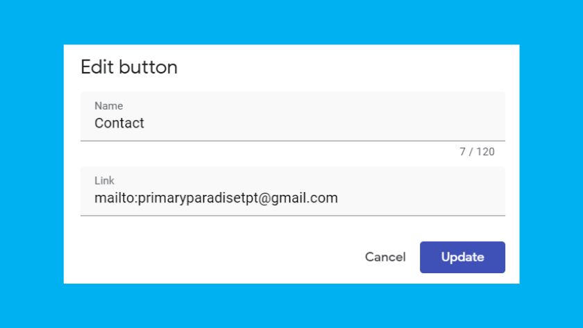
Tip: If you create a button and name it “contact”, you can put mailto: and then add your email address, and it will open up their email program (like outlook) and it will open up an email with your email address in it. Don’t add spaces between mailto: and your email.
For example: mailto:yourname@email.com
Anything Else that Makes You Unique
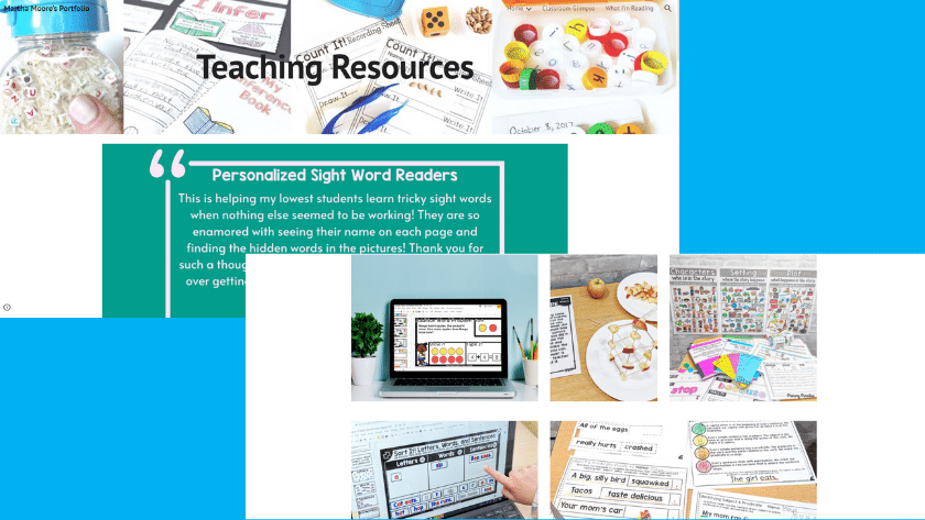
You’re unique. Your digital teaching portfolio should reflect that. I can’t tell you what else to include, but I can tell you what I’ve chosen to include. Since I’m an avid reader, I included a link to my GoodReads profile. I want future admins to know that I value reading, for enjoyment and to learn. I also blog and create teaching resources, so I showcase those as well. This is a huge part of who I am as an educator, and I want them to know that these are skills I have. The bottom line is that you can easily create a free Google Site digital teaching portfolio that will showcase who you are as a teacher. This will bring you one step closer to your dream teaching job.
You might also like these similar articles.
- 3 Mistakes New Teachers Make (and what to do instead)
- A Guide to to Navigating Teaching in an Instagram World
- How to Nail Your Next Classroom Observation
- Get the Most Out of Student Teaching (and 4 things to avoid)
Find me on Instagram, Facebook, Twitter, and Pinterest!
Join my FREE Facebook Club for k-2 teachers here!
